These are my first impressions of how WordPress Gutenberg works for creating a new post.
Maybe you’ve heard that updating to the latest version of WordPress involves more than the usual minor changes. WordPress 5.0 introduces Gutenberg, a whole new way of creating posts and pages.
This post is for fellow technophobe bloggers who are wondering whether it’s worth updating to Gutenberg and what awaits them when they do. I updated yesterday after about a decade of blogging with the “classic” WordPress editor, and this is my first post created with Gutenberg. I’ll walk you through how it works and my first impressions.
As you know if you’re a regular reader, I don’t normally write about tech stuff. But I thought that a lot of you use WordPress, as I do, and you’d like to know how the new system works. Plus it’s a good chance for me to experiment with it myself!
I use a self-hosted WordPress installation, but I think it’s similar on WordPress.com. If you’re on Blogger, just consider this a guide to what you’re missing out on 😉
How to Install Gutenberg
This part is easy. Just follow the usual process you use for updating WordPress, i.e. clicking on the link that tells you a new version is available or going to the “Updates” section of the Dashboard.
If you’re sensible, then take the advice and create a backup; if you’re like me, just ignore that part and enjoy a momentary feeling of weightlessness as your blog disappears and you’re not sure whether it will come back or not.
And that’s it! When you update to WordPress 5.0, you have Gutenberg installed automatically.
How Gutenberg Works
When you open up a new post, things look much cleaner and whiter.
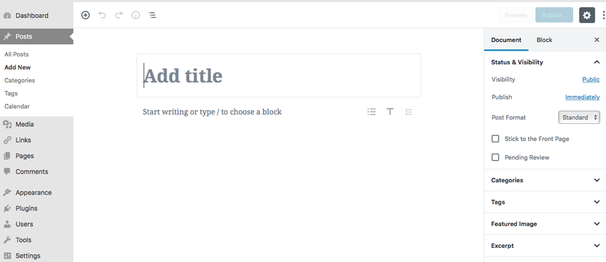
I found it both new and familiar, which is ideal. It has some new features like blocks, which I’ll get to in a bit, but it also looks familiar enough from using the classic editor all these years.
You still have the somewhat familiar sidebar on the right, but it looks much cleaner, with dropdown menus hiding options you’re not using right now. And this sidebar changes depending on context, which again I’ll get to later, but it’s really quite good.
You get some little tips popping up when Gutenberg first loads, but you don’t really need them. It’s obvious what to do: add a title where it says “Add title”, and start writing your post underneath.
Gutenberg Blocks
Each time you hit “Return”, you create a new “block”—in this case a paragraph block. So instead of one long stream of text, you have a bunch of separate blocks—one for each paragraph, heading, image, etc.
The advantage of this is that you can move them around very easily if you want to, just by grabbing the side of a block and dragging it up and down.
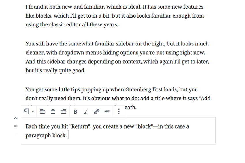
You’ll also see a contextual toolbar above the block to allow you to change the formatting in various ways. This only appeared because I was hovering over the block with my mouse cursor—most of the time, it’s invisible.
There are lots of features like this, which make the whole interface feel much less cluttered—things only appear when they’re needed, and they disappear again when you’re not using them.
Adding Images
So adding a text block is as easy as hitting “Return”. Adding an image is very easy too. After you’ve hit “Return”, you get an “Add Block” option on the left (there are several different ways of adding blocks, but this is the simplest I’ve found so far).
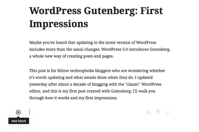
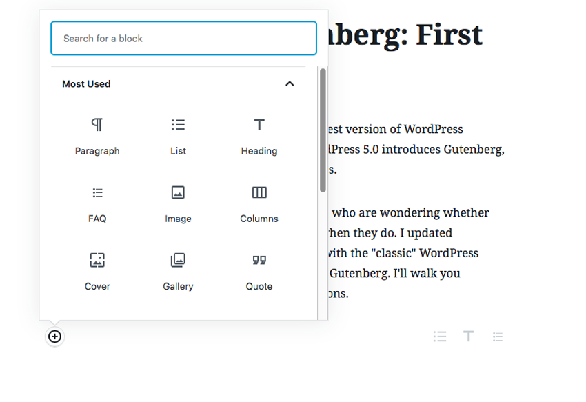
Click it, and you see a whole range of blocks you can add. For now, I just clicked “Image”.
As the image is uploaded in the document, you see that the right sidebar changes. Instead of showing document settings, it now shows settings specific to this block—in this case, the image options like adding alt text, picking a size, etc. Again, it’s really simple to use.
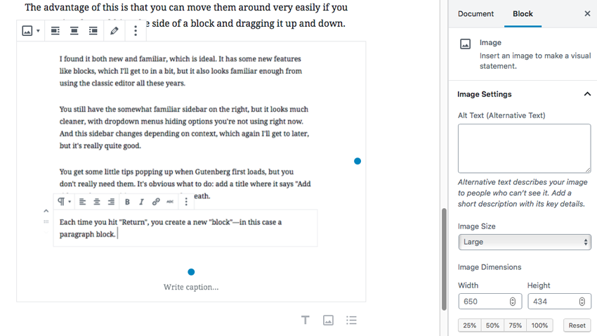
My only complaint is that I like to insert my images at Full Size, and it would be good if it remembered the last choice, instead of defaulting back to “Large”, which I never use.
Other Block Types
There are loads of block types to choose from, giving you more flexibility in layouts.
For example, you could start writing in columns if you want.
I’m not sure right now if I’d use this, but maybe for side-by-side comparisons it could be good.
There are options for quotes, poetry, image galleries, buttons, tables and so on. And you can embed things from a range of social media sites.
I haven’t tried most of these options, but they look as if they should make it much easier to create complex layouts in WordPress.
You can easily format paragraphs with backgrounds and text colours too. And change the font size.
You can even embed widgets. For example, here are the latest comments on my blog. I assume they’ll update all the time. There are probably uses for this feature that I’m not seeing just yet…
Yes, exactly! You’re right, there are plenty of Borges stories where the titles are intentionally misleading. I could probably write…
Hi Susan, Thanks for stopping by! I agree, the themes are more compelling than the characters. And yes, it might…
Another good story. I like how Borges’ titles often mislead. I mean, in this case, the reader will think the…
I just finished reading this book and found your review here online. Your review was good, and I appreciated reading…
I can certainly understand that, Bean! Thanks for mentioning My Friends – I hadn’t heard of the book or the…
And I think that this will expand as time goes on—I believe that the creators of themes and plugins can add their own custom blocks, so there will be loads of ways to use blocks as people develop them more.
Plus you can create your own “reusable blocks” that you can just drop in wherever you want. So if you have a certain image or text box or other element that you use again and again, this would make things much simpler.
The End Result
Gutenberg is what tech people call a “back end” upgrade… I think… What that means is that it affects how you create a post, but it doesn’t change anything on the “front end”, which is what the public sees.
Of course, if you add fancy layouts and embedded fandangles, those will all show up. But what I mean is that if you just type out paragraphs and headings and add some images, things will look the same as they did before. Gutenberg doesn’t change the styles or design of your site.
Verdict: Gutenberg Is A Surprisingly Good Thing
I am the sort of person who hates to update any software or app because I’m generally annoyed by the changes and want things back the way they were before. I was apprehensive about this change.
But Gutenberg surprised me. I found it very easy to use. There was no “learning curve”, and I spent almost no time looking for how to do something.
What I like most is the clean layout with loads of white space. By making things appear only when needed, the creators of Gutenberg have managed to add a lot of new options and functions, while making the screen less cluttered than before.
I’m sure there are lots of extra features I haven’t discovered yet, so don’t consider this a definitive guide or anything. These were just my first impressions as I created my first Gutenberg post.
The bottom line: I think you’ll like it! It’s easy to use right away, and there are loads more features that you’ll probably discover over time.
I’ve seen quite a bit of griping on Twitter, though, so you may disagree. When you’ve installed it and tried it, I’d love to hear your thoughts, complaints, tips, etc…


There are 4 comments
It sounds like a neat interface. I am unfortunately on Blogger. WordPress seems better but it was a decision I made when I started blogging. Gutenberg is also a cool name 🙂
I remember in the early days of blogging, there was a lot of talk of WordPress vs BlogSpot (as it was then) vs TypePad. Now everyone seems to have settled on one or the other. It would certainly be a lot of hassle to change, so it makes sense to stick with Blogger now. I just couldn’t resist a little dig 😉
Sounds like there are lots of interesting changes! Easily embedding widgets sounds like a nice back-end upgrade with snazzy front-end appeal. Have fun with all the new features!
Yes, it looks good, and I think they’ll keep adding more features. Have you tried it yet on your site, or are you holding off on updating for now?